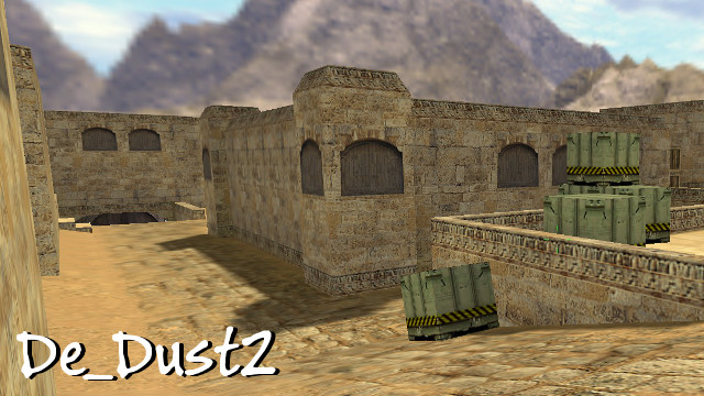
You could argue that Dust2 is the most famous first-person shooter map of all-time, alongside Halo‘s Blood Gulch. Being featured in every Counter-Strike game since 1999, it has remained the primary casual and competitive map for the franchise. And while it’s seen dramatic visual alterations over the years, its layout has remained largely the same.
Despite its popularity, Dust2 creator Dave Johnson wasn’t expecting success when he published the map. In-fact, he has remarked that he “hated” the map due to compromises he had to make during its development, and that it “would be a foolish attempt to repeat the success of Dust”. He’s since remarked that he has “no idea how” it has done so well.
This morning Johnson opened up on Twitter about his creation of Dust2, providing insightful details regarding the map. Let’s talk about what changed leading to its success today.
Caverns and No Bomb Site B Window
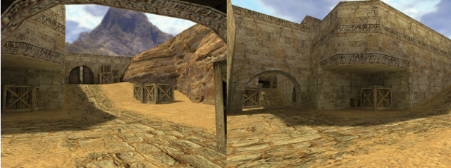
Early versions of Dust2 had more indoor and covered areas that Johnson referred to as “caverns”. Its earliest version went as far as to place bomb site A indoors surrounded with stacked crates for cover. In addition to this, the map was more open, with no mid double doors.
During this time there were covered areas scattered around the map, the most surprising of which was located on the right side of CT mid. Providing additional cover, it was decided that it veered the map too far to being CT-sided, requiring Ts to check an abundance of corners. This location was soon patched with stone and its boxes were placed to the left of bomb site B’s double doors.
[ Fun Fact #1: Dust and Dust2’s green boxes contain chemical weapons. ]

Following this, Johnson found that bomb site B’s single back entrance was too much of a choke point, so a window was added. The window’s irregular shape was a point of contention during development alongside the spiral staircase of B tunnels, but would make it into the final version.
Following this, some minor work was put into the layout of bomb site B, which originally placed the plant area in the center. Now located in the corner near window, it would achieve its final form, one that would survive the test of time.
A Much Longer CT Spawn Ramp
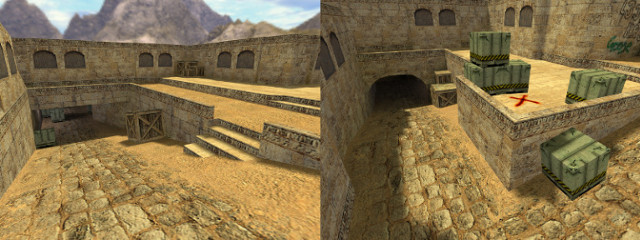
The earliest version Dust2’s bomb site A was a near direct copy of the original Dust’s T-side underpass entrance, with stairs and all. This would be reshaped over several days (you can see the similarities in the image below) as Johnson desired to make the sequel similar to its predecessor thematically without duplicating any of his work.
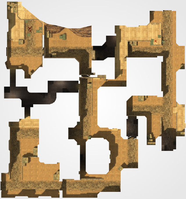
As bomb site A was being reshaped, the vision was that the ramp that leads from CT spawn to long A and goose wasn’t supposed to form a T-junction. Instead, it was “meant to keep going”. This section of the map was to extend much farther out beyond where car is located. However, the imposed size limit (8,192 X/Y/Z) of Counter-Strike maps limited its scale, forcing Johnson to make the location more simple and compact.
[ Fun Fact #2: Counter-Strike: Global Offensive maps have a space limit 64 times larger than Counter-Strike. ]

Although it’s unclear how this extended CT spawn ramp would have looked, it would have undoubtedly made bomb site A a more complex location. If this were the case, it would likely be much more challenging for CTs to defend; they are already spread thin between the openness of catwalk and long A, both of which provide few strong defensive positions.
This change would have completely altered how the map is played. Currently, peeking at long A’s double door and pit corner is enough to make even veteran players uncomfortable. Any addition of cover, or an alternate route, would leave Ts less exposed, making site entry a less imposing task.
Long A Wasn’t Supposed To Exist
Upon finalizing the bomb site A design, long A’s shape would become Johnson’s final task. As with the design of CT spawn ramp, he found that “running out of world space” would limit the scope of its design. Long A would naturally become the simple, long-distance shooting lane that snipers love today.
Johnston remarked that the final design of long A “felt super awkward at the time”, stating that he thought about shifting the map to make more room, but didn’t “fancy having to realign textures”.
[ Fun Fact #3: Dust (originally called cs_destiny) and Dust2 were inspired by early screenshots of a Team Fortress 2 map. ]

Most areas of Counter-Strike maps tend to offer three or more angles of sight with a wide selection of cover. Long A betrayed this common design choice, which was a huge risk at the time. Remarkably, this resulted in one of the most distinct battle areas of any map in the game, one that promoted intense long-range shootouts.
With long A’s completion, Johnson spent time polishing the map before sending a final version to Valve for evaluation. It would soon be published in March 2001, featured as part of Valve’s official Counter-Strike v1.1 update
If you’d like to learn more about Dust2 and its design, Johnson shared more details in a blog post which you can read here.


