Here at GameRevolution we take feedback very seriously. Recently we’ve revived several classic recurring features that our readers enjoy. Today, we take an even bigger step by introducing a new feature: the Dark Theme.
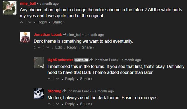
Back when we relaunched the website on May 31st, there were initially three users who suggested that we add a Dark Theme: nine_ball, UghRochester, and Starling. Shortly thereafter, a few other users would chime in and agree that having a darker theme that’s easier on the eyes would be an important addition.

It made sense: GameRevolution has always identified as bold and daring. While a clean, highly functional website is important for the user experience, who’s to say that you can’t blend darker tones with minimalism?
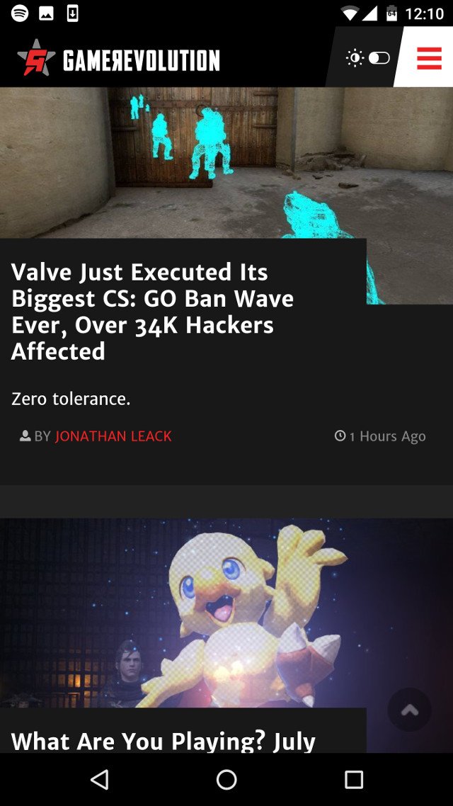
Starting today you can toggle between Dark and Light Themes at the flip of a switch. The option is located at the far right side of our navigation bar, and instantly transforms the site without any other steps.
This toggle is available both on desktop and mobile. The mobile version is demonstrated in the image below, with the toggle seen at the top-right.

Thank you to our tech team for making this happen. They’re currently busy with an incredible amount of work related to optimizing GameRevolution and making it the best version of itself it can be.
Equally as important, thanks to our readers for not only supporting us, but providing feedback. We hope to see you in the comments sections and forum.
– Jonathan, Executive Editor of GameRevolution


