NBA 2K18 has a lot to offer for fans of the series. Alongside some serious overhauls for MyLeague and MyGM are structural improvements that will address both gameplay and presentation.
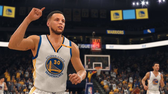
On the note of presentation, many people have been wondering how the graphics compare to last year. NBA 2K17 was a very attractive game with impressive animations, yet NBA 2K18 will look even better.
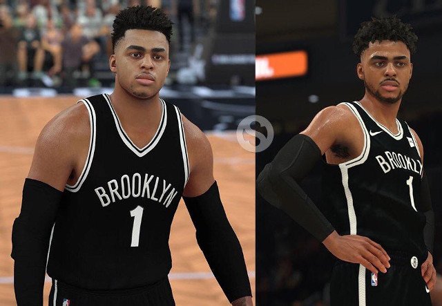
In the below image you can see how De’Angelo Russell of the Brooklyn Nets looks in NBA 2K17 (left) versus NBA 2K18 (right).

Notice how De’Angelo’s sleeves look much better on the right. Also, his frame is much more accurate, instead of the huge shoulders of last year. This is because 2K Sports has spent time trying to accurately model each player.
In addition, the lighting in NBA 2K18 is much more refined. Instead of players having a plastic-y look, they will be much more true-to-life.


