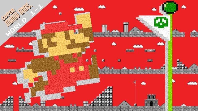
The Perfect Level is a weekly series in which GameRevolution’s writers dissect and discuss the very best levels in video games. To kick things off in its inaugural episode, we felt there was no better starting point than Super Mario Bros‘ iconic ‘World 1-1.’
Super Mario Bros designer Shigeru Miyamoto wasn’t just crafting a tutorial when he built the game’s opening level; he was establishing a whole new world.
Super Mario Bros was released on the NES back in 1985, at a time when the majority of the gaming conventions we’re now accustomed to had yet to become commonplace. For many, Super Mario Bros was much more than their introduction to the now-iconic protagonist plumber — it was also their first foray into video games altogether. Miyamoto needed to use World 1-1 in order to cement ideas that would soon become the new standard for the medium, and that would also form the foundation of Nintendo’s seminal platformer.
Super Mario Bros was co-designed by Miyamoto and Takashi Tezuka, though it was the former who was responsible for crafting World 1-1. While other levels in the game had already been designed, its opening stage was finalized later in development, meaning that Miyamoto needed to outline all the ideas that he and Tezuka had already implemented in a way that was easily digestible for the newcomer. So how exactly did he achieve this? Let’s take a look at The Perfect Level:
Accessibility is key
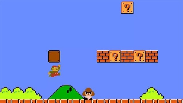
World 1-1 didn’t just serve as a starting point for Mario — it presented the first steps in a brand new era for video games.
In an industry mostly populated by games that aped the coin-grabbing arcade machines of the time, accessibility was overlooked in favor of providing grueling challenges. Miyamoto and Tezuka didn’t believe in this design ethos for Mario, opting to instead hold the player’s hand in a way that wouldn’t feel too obvious. Every pixel in World 1-1 served a purpose, with it designed to inform and educate rather than frustrate.
Compare this to the opening level of another classic 1985 platformer, Capcom’s Ghosts ‘n Goblins. Designed with arcade cabinets in mind, Ghosts ‘n Goblins immediately presents a barrage of challenges with little breathing room. Enemies fill the screen, a ladder to access a higher platform is blocked by respawning zombies, and the player-character’s stiff movement made the homing attacks of its persistent enemies even more difficult to avoid. In short, it’s hard as nails.
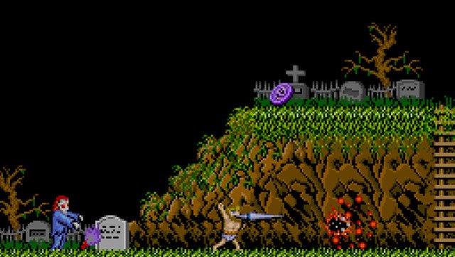
Ghosts ‘n Goblins was intended to make the player want to keep inserting coins into a machine, and the proliferation of arcades at the time ensured that many games were similarly difficult. However, the trend of bombarding the player with hurdles to overcome from the get-go bypassed the growing appeal of home consoles, which was to be able to experience these games from the comfort of your own living room at your own pace.
While there are many who are cool with screaming at their TVs, others just wanted to explore weird and wonderful virtual worlds. Placing an emphasis upon forcing a player to repeatedly stare at a ‘Game Over’ screen may have been just fine for experienced players, but it wasn’t exactly conducive to convincing newcomers to invest in the hobby. Nintendo gave Mario widespread appeal by virtue of presenting a challenge that wasn’t designed to be nigh-on insurmountable for the common player, with World 1-1 carefully giving them all the instructions they needed to make their way through the rest of the game. But how did Miyamoto pull off such a feat in a level that is built to be beaten in less than two minutes?
Right is right
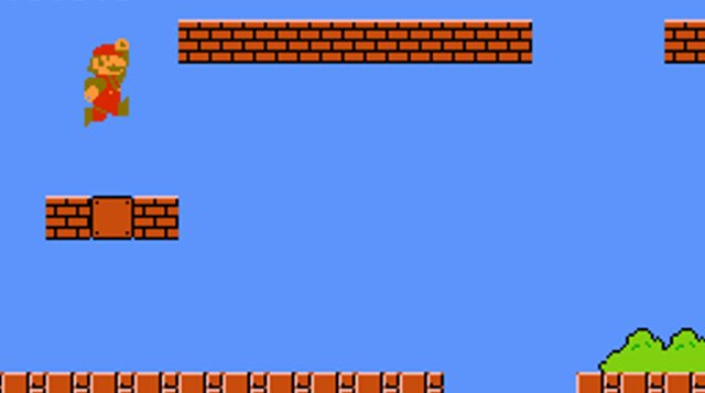
The first rule that World 1-1 presents to the player is that progress is only achievable by moving right. Though future 2D Mario games would allow the player to go back on themselves, in Super Mario Bros the boundaries of the screen provides an invisible wall that prevents them from moving left, instantly indicating that there is only one way to go if you want to make it to the end of the game.
In the opening screen, the player is afforded breathing room by way of an empty space to fiddle around with the game’s controls. If they move to the right the screen will follow them, and inquisitive players will inevitably attempt to experiment by going left only to be prevented from doing so by the wall. This informs the player that going back isn’t an option, and anything that they leave behind will be lost as they progress.
This may seem straightforward now, but 1985 was an era in which platformers had yet to become the genre for video games. For many, the NES was their first home console and Super Mario Bros their first video game, so mechanics we now believe wouldn’t warrant an explanation were alien to those acclimatizing to the medium. Nintendo took it upon themselves to broaden video games’ target audience, with Super Mario Bros contributing greatly to this, as evidenced by this 1987 Inside Edition report:
Goombas and Koopa Troopas
Establishing that moving right is the key to success also helps introduce Mario’s first enemy, the lowly Goomba. If Mario’s progress is limited to him running ahead, then the Goomba swiftly marching towards him indicates that this character is designed to impede his progress. His mean, furrowed eyebrows are a dead giveaway that he’s a bad guy, too.
Miyamoto had initially intended for a different enemy to take the Goomba’s place in the game’s opening level. “Originally we had a Koopa Troopa that came out, but we thought it might be a little too difficult for the player to jump on and then kick it,” he told Eurogamer in an interview back in 2015. “That’s why we created the Goomba. If it was a turtle, we couldn’t really just jump on it and defeat it. So we decided we needed a ‘bad mushroom’.”

With the Goomba’s design resembling that of Mario’s most famous power-up, Miyamoto needed to differentiate the game’s bad guys from the mushrooms that players could use to help them on their adventure. As such, the first structures that the player encounters are a combination of ordinary-looking brown bricks and mysterious question blocks. These flashing, golden blocks are inviting the player to hit them, and when they do so they’re either rewarded with a few coins or a moving mushroom.
Miyamoto made the mushroom difficult for the new player to avoid, with a pipe blocking their path and the power-up dropping down from the platform above them. This ensures that the player immediately understands that these bigger mushrooms aren’t obstacles for them to avoid, but rather a way to increase Mario’s power.

These simple but effective tutorials are repeated throughout World 1-1. One of the most unconventional mechanics introduced in Super Mario Bros is the introduction of the dash button, allowing players to have greater variety in their movement by way of affording Mario with an increased running speed at the touch of a button. In order to get players to try this out, Miyamoto introduced a wide horizontal jump across a bunch of stacked blocks.
“We added a hole that you’ll need to speed up for and then jump,” Miyamoto explained. “We made sure that there were some parts that even if the player fell, it would be safe. By doing that, we wanted the player to gradually and naturally understand what they’re doing. The first course was designed for that purpose. So that they can learn what the game is all about. But then after that, we want them to play more freely. Once the player realizes what they need to do, it becomes their game.”
Miyamoto guiding the player but then handing over the reins of the game to them to do as they please is something that has carried over into the vast majority of Nintendo’s output, with modern releases such as Super Mario Odyssey and The Legend of Zelda: Breath of the Wild representing the pinnacle of what can happen when the player is allowed to do as they please with a game’s mechanics.
Over 30 years since the release of Super Mario Bros, Super Mario Odyssey introduced the most freedom of movement that the Mario series has ever seen, granting the iconic platforming hero an arsenal of jumps, dives and other assorted moves, all of which stemmed from Miyamoto and Tezuka’s decision to give Mario a running jump back in the ’80s. But while Mario’s move-set may have changed dramatically, one staple of the franchise has remained as recognizable as ever: the Mushroom Kingdom.
Introducing the Mushroom Kingdom
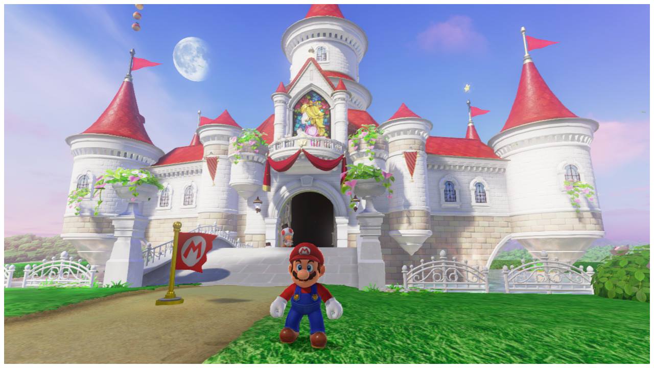
Super Mario Bros clocked in at a minuscule 31KB, with the NES’s technical limitations meaning that its designers had just 56 colors to work with. Despite this, they somehow managed to construct an entire world that is easily recognizable as the Mushroom Kingdom we know today.
Nintendo released the game in an era when games tended to veer between high fantasy and sci-fi, with little room in between. By contrast, Super Mario Bros introduced a new, unique and thoroughly surreal world that was unlike anything players had experienced. Not only was the hero an overall-wearing plumber, an odd choice for a children’s game if ever there was one, but the scenario that was immediately presented to the player in World 1-1 raised more questions than it answered. What’s with the giant green pipes? Why does this turtle want to kill me? Why does eating a mushroom make me double in size?
The inherent weirdness of Super Mario Bros‘ world has helped it withstand the test of time, with the conventions established in this first game still present and correct in Mario games today. The Mushroom Kingdom is still known for its blue skies and green hills, Mario still seeks pleasure in eating mushrooms and those turtles are still angry as ever.
It’s a testament to the original vision of Miyamoto and Tezuka that Nintendo has never had to shed its roots, as the Mushroom Kingdom remains as inviting as it was back in the ’80s. All of this was established by World 1-1, a true masterclass of game design that served as the opening chapter in a brand new era for the industry.
