He bawks at art. And clucks at cases.
Bioshock Infinite's cover art stirred up some fan backlash in recent weeks, and consequently, developer Irrational Games held a fan vote to decide on an alternate image. Many fans applauded the move, thanking the developer for listening to its audience. Others raised their indifferent eyebrows at the whole fiasco, and others still expressed dismay that something as simple as box art could possibly be the subject of an real complaint. Does box art really matter? Did Irrational Games do the right thing by offering the alternative? What does all of this mean?
We all know the old advice not to judge a book by its cover. After all, how much can you really tell about a book, movie, or game by its posters or its packaging alone? Take a look at two similar covers, Call of Duty: Modern Warfare 2 and Spec Ops: The Line. Same color palette, and both have a single armed soldier front-and-center, wearing a mask and looking like a badass. At first glance, you might think these two are from the same franchise, if you didn't know any better.
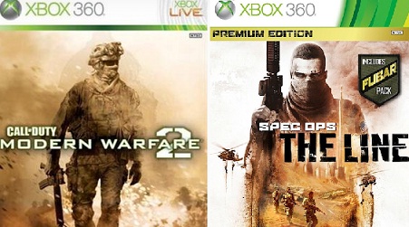
While these games do share a lot of overlapping themes and have the word "shooter" in their genres, they provide wholly different experiences. One is a first-person shooter whose biggest selling point is its online multiplayer modes. The other is a third-person shooter with tactical squad support, and whose most compelling aspect is its stunning, impressive single-player campaign. While both can kind of do what the other does, let's face it, you play these games for different reasons. Add Deus Ex: Human Revolution into the mix, with its shades of brownish orange and gun-toting, center-aligned badass, and you get yet another similar box guarding yet another different experience — this one even more extreme than the differences between Spec Ops and Modern Warfare.
The Japanese version of Similar Box Disease is best encapsulated in a fancy move I lovingly call "The Big Reach," shown thrice below:
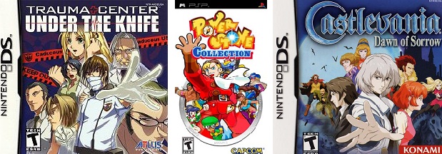
Those are Trauma Center, Powerstone Collection, and Castlevania: Dawn of Sorrow, three games that couldn't be more different, yet all have the protagonist giving The Big Reach, his fellow cast members standing boldly behind him.
This happens because, tough as it may be to accept, sales matter. Box art is often chosen based on giving some vague idea of what's in the game or what the story is about, but equally important in the choice is an image's ability to attract more buyers. Games aren't free to produce, and a certain sales bar must be met. People are proven to react more strongly to certain images than others (though they can vary by culture, age, and other factors); this is why we see consistent use of the bald space marine, the under-dressed girl, and The Big Reach on countless packshots. I get a little bit perturbed sometimes when I read comments around the internet that say things like "They're just trying to make money," and the like, because yes, obviously, any company's goal is to make money — or at least, it's one of the goals. It has to be, or else we won't be getting any more games from that company after the first release. A game company wanting to make some dough is neither criminal nor immoral.
Where the notion runs into trouble is when it becomes the one and only priority. I once compared Monster Hunter, God Eater, and Lord of Arcana. Capcom made an original product, Namco Bandai made something similar in their own style, and Square Enix made a completely knockoff looking for a piece of the pie. Guess how the three rank in terms of both popularity and critical acclaim? Square Enix began the project with the goal of grabbing some cash, and so the project fell flat. A similar complaint can be made about Call of Duty: Black Ops Declassified, which was clearly sent to market in an unfinished state. Activision's objective was to make some guaranteed holiday cash, and this took priority over literally every other aspect of the game's production. Rather than release the game in the Spring, by which time it could presumably be called a finished product, Activision stuck with its November plans and gave its customers a half-baked mess.

But wait, what does all of this have to do with box art? It means that the box, in most cases, shouldn't be taken as an indication of the inside. What lies within that box might be a delightful, satisfying, memorable game. Meanwhile, in order to make sure that future games can be funded, the publisher asks for your kind understanding in putting a gruff dude with a heavy firearm on the cover.
The Bioshock Infinite situation raised questions and complaints for a reason beyond just the image on the box, however; the reasoning behind it raised red flags too. Ken Levine said of the image that he was inspired by going to frat houses. This, while not damning evidence, may scare some into thinking that Irrational Games may be selling out. Square Enix used to deliver hit after hit, yet ask the company's fanbase if the company what it used to be, and you'll get a storm of negative responses. Call of Duty is the most famous shooting franchise in game history, yet Declassified was a clear cash grab move that stands as an insult to the game industry. Money talks. Levine's open admission that he was surveying frat houses, and that he made any creative decision at all based his findings with that one demographic, might set off an alarm.
Don't think it can happen? Then consider Bioshock 2. It's widely considered inferior to the first, because not all of the resources were put into the single player aspect of the game. Instead, the team saw fit to slap on some multiplayer, because after all, multiplayer is huge selling point among… you guessed it, frat boys. Go to some fraternities and ask how many people have played Halo, Madden, and Call of Duty; you'll find that these are the biggest names in the house. Bioshock's team had already made the mistake of compromising its vision for the sake of appealing to the mass market once, and despite the new game being confirmed to lack multiplayer, who is to say the game couldn't be gimped in some other way in a second attempt to sell a copy to anyone and everyone? How many times have you heard a developer declare that a problem has been fixed, only to find out that it definitely wasn't, or that another issue has taken its place?
One might get especially concerned about this when considering the discussion of whether or not games are art. Some people will tell you that games have always been art, some say that the medium has a long way to go, some might tell you that it depends on the game, and others say that no game ever was art and no game ever will be. The definition of art and whether games can be categorized as such might remain a debatable issue for decades to come, but the topic becomes relevant here. If you don't believe that games are art in any way at all, then the images on the box matter little, if at all. If you believe that games are art, then the packaging might be viewed as an extension of the piece.

More specifically, the views of the game maker are important here. Supposing that the creator views the game as art, the box art could be considered a part of that, conveying in image form what the game is conveying with its play, its music, and/or its story. So when the game's creator chooses to put something on the box — whatever it is — those looking forward to said game are not necessarily in the wrong when taking it as an indication of what's inside. Someone within the group responsible for getting this game from concept paper to your living room decided that the most appropriate outward expression of this game was Nathan Drake's cousin carrying a shotgun and being too cool to give a damn.
After all, what makes art of any kind so special is the creator sharing his or her vision with the rest of the world, often with such power that it leads to countless discussions, references, and even imitations.
People travel from distant places to see original versions of the most famous paintings, and pay good money to hear live music, see movies, go to the theater, and experience art in its nearly infinite forms. Art communicates with us in a way that a conversation can't. It affects us on a deep, personal level as the artist conveys feelings to us through his or her chosen medium. Every word of a poem, every part of a movie character's costume, every note of a song, every stroke of a paint brush is part of its collective work for a reason. If a creator views his game as art, then it's therefore not unreasonable to draw a conclusion or two from the image chosen for its cover.

Irrational Games did well to add a second cover art option, as well. What that shows is that while the company still has faith in its original decision, it recognizes the importance of the community's opinion. The people vocalizing their dislike of the image, after all, are the very customers that made Bioshock a hit in the first place. They indirectly signed Levine's paychecks, and they are the reason the people at Irrational Games have their jobs to begin with. The act demonstrates a respect for customers any business ought to have. You can't bend on everything, but sometimes, no matter what business you're in, you have to listen to what your customer base is saying.
Whatever the case with Bioshock Infinite, all's well that ends well, and the community now has a second option. Whether or not anything within the package has been compromised, we'll have to wait until March to find out.
If you liked the joke box arts, check out this thread at NeoGAF. It's gold, my friends.
