Last year the Oculus Rift sold me on the potential of VR with its brief Hawken demo. Since then I’ve seen a number of demos using the Rift, and I've have haunted YouTube channels devoted to Oculus Let’s Plays of popular first-person games. I don’t have a PC capable of working with the Rift, but I do have a PS4. So naturally, with Sony’s reveal of its own proprietary virtual-reality hardware for the console, Project Morpheus, I wanted to see all the demos to get an idea of how well the tech works. So here’s a rundown of the positives and negatives revealed by the tech demos.
The Deep
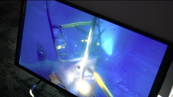
The Deep, produced by Sony’s London Studio was one of the first two demos available and the weakest of the four. In this demo, the player stands in a diving cage that descends next to a reef, full of colorful fish and one very aggressive shark. Less of a game and more of an interactive 3D movie, the demo explored the murky depths of the sea which allowed the fish to move in and out of view without having to worry about a long draw distance or other technical issues. The player has the ability to fire a flare, but this does basically nothing.
However, The Deep also made it clear just how important keeping the avatar in sync with the player is for VR. As excited as I was to see the environment, when I turned around to follow the shark through the murky water, I looked down and saw the top of the back of my torso, with the neck turning into a tiny little knot. Since I expected to see my chest when I looked down and instead saw my back and a totally creepy neck-nub, it completely took me out of the experience.
One of the Sony techs also told me that a huge part of The Deep was Sony’s proprietary 3D audio, with sound coming from atmospheric locations depending on how the head had turned in a much more complex way than traditional surround. However, the headphones that Sony was using at their booth weren’t noise-canceling, so this was almost impossible to hear.
The Castle
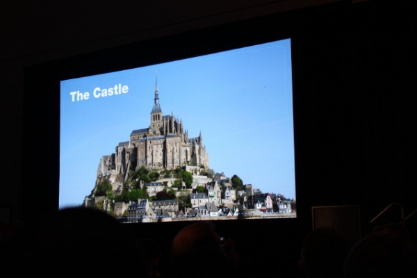
The second demo available is The Castle, produced by Sony’s R&D department. This demo uses two Move controllers in place of hands. The player is stationary in this game as well, but it dispenses with a body, just giving the player a pair of floating gauntleted forearms. The gauntleted fists can be used to grab or punch an armored floating dummy, then later be used as a pair of swords, and finally a crossbow to shoot at stationary targets.
The Castle is the most immersive of the demos because of the combination of headtracking and one-to-one precision of the gauntlets to the Move controllers. I felt like I was completely in that environment. This is especially true with the swords; the game is designed with a person of average height in mind (I’m a little taller than average), so to pick up the swords that had been stuck point-down next to me, I had to turn and lean down in order to properly grasp it, which really made me feel like I was there.
The swords sold me on the Move/Project Morpheus combination. Using one sword, I kept the floating dummy in place, while I chopped off limbs with the other. I heard that other players had used one hand to hold onto the dummy’s arm for the same purpose, chopped it off with the sword in the other hand, and then beat the dummy with the dismembered limb before tossing it onto the field in front.
Visually, The Castle paradoxically had what felt like the least realistic-looking space, but also the most real-feeling. This is because the developers realized (only a couple weeks before the demo went up, as it sounds like these were put together very quickly) that normal textures and shaders don’t work correctly in VR (more on that when I discuss the Thief demo). So everything in the demo was built architecturally: the mottled stone in front of the player had to have that mottling modeled in—so that the light would reflect differently to each eye, giving it greater realism—even as it ismuch less detailed.
The Castle also showcases other problems with the early tech. The Move control scheme had occasional glitches during the demo and had to be reset twice while I was playing. This resulted in the arms suddenly jerking forward into the center of the frame, their default start point. Though it didn’t need to be reset, I had to hold my arm incredibly low and out-of-sync with the in-VR-experience to aim the crossbow properly, and aim was very difficult. Other players and I shared the experience that the gauntlets also seemed to randomly drop the objects being held, every now and then.
At one point, having dropped a sword, I knelt down to try to pick it up. The experience was oddly disjointing. Since I was taller than the intended player, I sunk down both too shallowly in the body, but somehow too deeply towards the ground at the same time; it looked like my hand should have gone through the floor as I reached for the sword (they hadn’t programmed in the capability to pick it up, once dropped, though). In the end-cap, a dragon flew in and ate me, a nice cartoony addendum.
EVE: Valkyrie
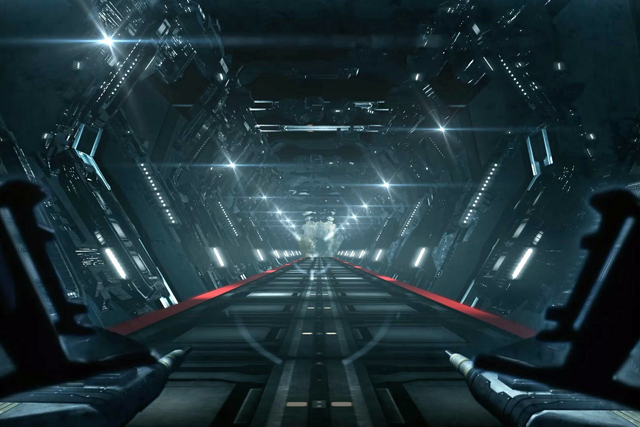
The most successful demo, which GameRevolution's Nick Tan reviewed in a manifesto to glowing acclaim, is CCP’s EVE: Valkyrie. Valkyrie is an in-development space dogfighter game that is, in my assessment, the first commercially viable game built from the ground up specifically for VR (another, earlier version of the demo was shown at the Oculus booth), and it shows. Though it lacks the immersion of The Castle, it doesn't have any of the glitches and is actually a good game. Though it has a low-res arcady look, it is still very immersive; and I leaned back into the seat as if feeling the G-forces as I was catapulted out into space, Battlestar Galactica-style.
Valkyrie’s amazing gameplay mechanic is that anything you can see in the center of your vision can be targeted with missiles. Machine guns only fire in the front, but having dispatched one enemy and flown through the center of its fiery explosive death (YEEHAH!), I craned my neck to find the next one by looking around and locking on, firing missiles while I pitched the fighter up to add machine gun fire to the mix. Whereas the previous tech demos are very clearly demonstrations, Valkyrie shows the potential of what a game can and will be in VR, and does so with a great deal of polish.
Valkyrie is also multiplayer, with two competitive head-to-head players surrounded by a number of bots, showing that the tech doesn’t impede multiplayer experiences. Where Valkyrie is less immersive than The Castle since there is no haptic interface (a game like this could bring a resurgence of old-school flight-stick controllers), it isn't a problem since the player and their avatar are seated in the cockpit the entire time, making it easy to sink into the reality.
Thief
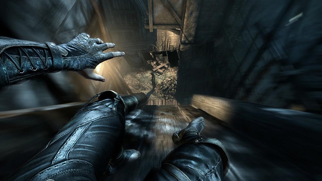
More problematic, and practically a treatise on how conventional game development doesn’t work for VR, is Eidos/Square-Enix’s Thief demo. During Sony’s talk that revealed Project Morpheus, the speakers laid out a roadmap to successful VR experiences. Some of these are that “headtracking is king,” and that taking away control of the player view makes them sick; another is that high frame rate and low latency are priorities. Thief had problems with all three, sacrificing frame rate, low latency, and headtracking for higher-resolution graphics and visual fidelity. The result is incredibly mixed.
Standing still, Thief looks wonderfully moody, with a high degree of detail that every other demo lacks. It is the only game that looked like it belongs on a current-gen roster in terms of its visual style and level of detail. The attendant warned me to try to use the movement controls as much as possible, only to use my right stick for turning and not looking, but even doing this made me nauseous after a short while.
Thief’s low framerate—I heard offhand that it was locked at 30fps, and that VR needs the benchmark of 60fps in order to work properly—makes it look like watching someone play the game through a crappy webcam capture that's sickening the more motion there is in frame. Even using the controller to turn creates a slight sense of vertigo, and there seems to be a slight delay between when I try to move or look and the action, increasing the problems.
Visually, Thief looks great-ish, though it has the exact texture/shader problem that The Castle developers works to avoid. The stony environments have an odd particle-board look to them, of a plastic un-reality, like looking up-close at a plastic bench painted to look like stone. The flame effects also has a very two-dimensional look, like someone had a moving cardboard cutout of flames that lacks any dimensionality to them (though it did have some nice smoke and spark particle effects).
Thief, in trying to create a higher-definition look, succeeds in the appearance of greater fidelity in its 2D textures. But everything looks like a plastic toy-set painted to look real if you squint or shut one eye. It highlights a number of problems that VR presents the industry, since rendering the images separately for both eyes requires a great deal of processing power.
Overall
Essentially, VR appears to have an issue where it’s necessary to scale back the visuals to what can be ray-traced and lit dynamically in order for environments to look natural. The scaling back is a necessary expense due to the processor costs involved with rendering out frames for both eyes at the same time from the slightly different angles in order to look properly “real.” In this case, lower resolution but more realistic rendering clearly trumps detail. The “arcady” look of Valkyrie and the more basic environment of The Castle performs better than the artificial murk of The Deep and the hi-def-aiming Thief, due to scaled-back but more accurately rendered visuals.
This loss of detail might sound like a bad thing, but the experience of being in a virtual environment that works perfectly is so much more immersive than being in one that doesn’t but has higher detail. Ultimately, it comes down to what has the most fidelity of experience, and in a virtual experience the space feeling real is clearly much, much more important than a higher degree of detail. Additionally, the 1080p screen is split between both eyes, halving the horizontal resolution (so each eye gets 960×1080 pixels), which has less clarity than the average user might expect, allowing for less detail.
To give an idea about how this plays out on an individual level, I would probably buy Project Morpheus if it had low, coke-bottle-lens resolution in order to get to play a full version of EVE: Valkyrie. That the tech is only going to get better is just icing on that virtually real cake.


