Take Rapture with you wherever you go.
Perhaps the biggest surprise of playing BioShock on a mobile device was the discovery of how well suited the game's design already was for mobile. After completing a short, early chunk of gameplay, I moved the nameless/faceless protagonist towards Neptune's bounty, to find a Vita Chamber ready to revive me if I died; I had forgotten how close together they were, making the game ideally spaced and timed for on-the-go play.
This is not to say that BioShock on iOS is without challenges, but it overcomes them particularly well, and in some cases improves elements of gameplay. While it's capable to play BioShock using any standard iOS capable Bluetooth controller, it also had to be optimized for players without access to one.
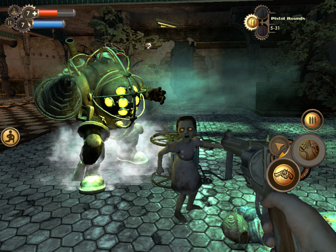
The touch controls are surprisingly nuanced, with touch movement on the left side of the screen providing move controls (with a wheel that shows up wherever you set down your thumb or finger) and a second touch on the right controlling where the player looks. A set of virtual buttons on the screen allow for fire controls, reloading, opening the weapon selection wheel, or switching from weapons to plasmids. Restoring health or Eve through consumable is as simple as clicking directly on the health or Eve bar.
At first when I tried it, this felt like the touch controls created a problem, because firing meant removing my thumb from the look controls, but the game has a handy aim-assist that follows an enemy once you get the reticule over them. There is still the problem of having to switch between viewing and shooting, and may mean taking a little more damage than usual, especially if splicers get in close; so what it does, to a certain degree, is change the conditions of play. It puts more emphasis on playing either stealthily or (as I did) hacking turrets and drones to do your fighting for you.
Hacking is much easier using the touchscreen controls, since switching out pipes is just a matter of tapping one and then tapping another, and I could sense that in this version of the game, I'd be much more likely to rely on traps and stealth.

Visually the game is BioShock. The 2007 game looked fantastic on the tablet I'd been shown—2K representatives indicated it was especially optimized for the iPad Air, adding that it looked great through an HDMI connection to a television—and when I asked what the low end was, they said they were still determining where the cut-off was, but that it would, of course, not play as well on lower-end devices. Textures were especially crisp and beautiful, with environments completely mirroring those of the original.
A big challenge for 2K was porting Unreal Engine 2.5 to mobile. Senior Producer Brian Lowe issued a statement that they had to make some sacrifices including dynamic shadows and changing the way fog effects worked; though these are not particularly damaging to the game's visuals on these smaller screens.
At a certain point I picked up the controller and activated it, playing the game with traditional controls. It's a tribute to the tuning that 2K has done to the game that I quickly switched back to the touch-based controls because they were easier and more intuitive. Most happily, BioShock remains BioShock: It was as chilling as I remember when the first splicer stood over me and called me "little fish" before being chased away by a Big Daddy, and the creepiness of The Little Sister prognosticating my death to "Mr. Bubbles," saying "He'll be an angel soon."
It's still BioShock, a fantastic game, on a different delivery platform. 2K is targeting the game for release later this summer at a premium mobile price on iOS tablets and phones.


