Testing your limits.
Minimalism is a school of thought founded upon a simplifying of form. So, for
instance, I could write a minimalist review of Unlimited Saga (after
all, an unlimited review of Unlimited Saga would destroy our servers):
“Unlimited
Saga is occasionally pretty on the eyes and ears, but a weak battle system,
cluttered menus and boring gameplay lead to a crummy RPG.”
Later y’all!
Well, if you’re still here, I’ll at least give you your money’s worth. Wait,
you’re not paying for this. Okay, I’ll give you more than your money’s
worth.
It’s ironic that a game title Unlimited Saga would go the minimalism
route. The series has long showcased clever visual tricks complemented by battle
systems that tended to take interesting risks. Unlimited Saga is no different,
but the results are far worse than its Playstation forebears.
Unlimited Saga showcases 7 characters that ultimately draw into one
larger story. There’s a former pirate, a knight, a fake fortuneteller and a
chapa, which is a fuzzy fox-like creature. The stories vary in quality; my favorite
is Judy, the young witch in training, because of her silly little girl antics.
The game takes you from village to adventure map and back again. In the villages,
you don’t walk around – you just navigate menus where you choose bits of information
from a few villagers, shop for items and select an adventure off in some field
or dungeon.
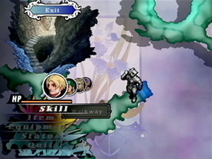
Movement through the dungeons, caves and various other maps ascribes to the
bare basics. There is a visual map that steadily reveals itself as you walk
from point to point. At each point, you can walk in up to 8 other directions
via a movement compasses. Most of the time only a few directions are allowed,
so it’s like navigating through a maze of paths. Requisite random monsters,
obstacles, treasures and traps get in the way, but these pared-down essentials
aren’t immersive in the least. Whatever happened to freely moving a character
through a full game world instead of point to point via a little silver character
indicator? I mean, it’s almost as if the character is pewter and you’re playing
this on your kitchen table with a 20-sided die. This setup could have worked,
but slowly inching along step by step is more boring than fun.
Battles are equally frustrating with a weak strategy foundation. At the onset of combat, five attacks are selected. An attack wheel rapidly spins to indicate the quality of the attack being made, but it spins so quickly that the attack might as well have been randomly selected. There is no skill involved in stopping the wheel at the desired selection.
Your attacks can be connected to one another for party combos, but the results
feel time and time again arbitrary because of the lack of skill in using the
wheel. The problem is the lack of a readily understandable checks and balance
system that underlies any decent battle system. If I wanted to play the slots,
I’d take a trip to Vegas.
 Another
strange new experiment is the diminished importance of HP. Battles can rage
on while characters have emptied their hit points. The crucial gauge is LP,
or life points. HP is like a shield for the life points; the fewer HP a character
has, the more vulnerable the LP. It sounds good on paper, but there’s no gripping
strategy to it in actual play. It’s poorly executed and makes for yet another
problem spot.
When the first images of Unlimited Saga came out, they seemed artistically
revolutionary. The textures looked like they were done with a combination of
colored pencils and watercolors. Too bad this is only a small fraction of the
actual game and therefore barely even factors in. The wool was pulled over our
eyes.
The actual game graphics are far, far from that level of technical prestige.
During the battles, you get basic sprite characters set against a simple 3D
environment with a camera that darts to and fro to simulate the frenzy of battle.
The characters have very few frames of animation, resulting in flimsy, weak
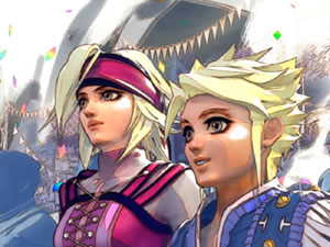
visuals. The narrative between battles and within the villages are condensed
into backdrops and talking heads. The heads slide in and out of the frame to
represent characters coming and going. What, was animation too time consuming?
Can’t you even give an eyebrow jiggle for Johnny? Where did all the effort go?
Well, some of that effort went into the music, with strong melodies and a
solid backbone of elegant piano. It isn’t nearly as good as Chrono
Cross or anything, but it still shines through. There are also decent voices
for nearly all of the characters. I’d expect Armic the chapa to have a cute,
squeaky voice, but for some reason he sounds like Pat
from SNL, which in turn makes him somewhat loathsome.
I can’t mince words – Unlimited Saga is boring. I mean, the battles
could have fallen back on the classic turn-based formula, or at the very least
opted for a passable framerate. And even if the minimal road had to be taken,
it could have been done in a much easier and welcoming manner instead of obtuse
for the sake of being obtuse.
I wholly encourage experimental gameplay and seeing developers try things
that haven’t been tried before. Yet before a game comes out of R and D and into
our living rooms, somebody first has to make sure it works. Unlimited Saga
would have made a much better illustrated storybook than a video game.

-
Good music
-
Artsy texturing effect
-
Boring game
-
Cluttered menus
-
Weak graphics and framerate
-
Not immersive at all
-
Randomized combat system


