Using the HTC Vive during the past week has been a magical experience. I've been transported to worlds so much more interesting than my own, going from battling drones on a sci-fi skyscraper in Space Pirate Trainer, to warding off zombies in The Brookhaven Experiment, and even directing air traffic in Final Approach.
Not everything is perfect, though. As with any new hardware launch, the number of long lasting titles with any semblance of replay value is minimal. Actually, in the case of the HTC Vive, you'll be hard-pressed to find a single game that accumulates more than three hours of playtime. Don't let their high price points fool you, most of even the highest recommended titles are arcade-style games that become repetitive within an hour.
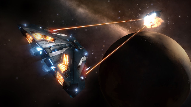
This is why Elite: Dangerous is such an important element of the HTC Vive's software line-up. Billed as the "World's Leading AAA Title", it's a game that, assuming you enjoy cockpit experiences and space exploration, can accumulate hundreds if not thousands of hours of your time. In the case of the Oculus Rift CV1, it's a system seller that enhances the experience of an already notable game in a remarkable way.
However, as myself and many other VR early adopters can attest to, Elite: Dangerous is not a wonderfully beautiful game on HTC Vive like it is on Oculus Rift CV1.
Upon loading up Elite: Dangerous, the first thing I was met with was white menu text over a 3D background. The text was difficult to read, to a point where I had to lean forward to tell what I was selecting. I was hopeful that this issue wouldn't persist into the live gameplay environment, but it did.
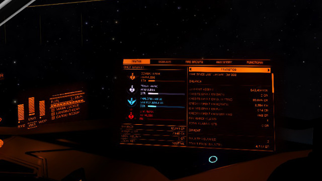
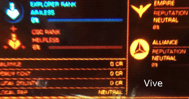
After creating a new character and being thrown into the cockpit of a Sidewinder, I was met with an array of orange colored HUD text that was even less readable than what was on the main menu. Whether I was trying to sort through the list of nearby star systems, observing commodities on the market, or interacting with mechanical elements of my ship, I found myself squinting and leaning forward to read the many menus necessary to function in the minute-to-minute experience.
This issue of image quality also translated into the world around me. Structures in the distance, especially those with straight lines, shimmered with the worst aliasing I'd seen in my life. Textures appeared muddy in a way that felt like I was jumping back two gaming generations. The result of these two issues turned what is normally a spectacular visual experience into something notably bad.
After heading onto the internet, it became clear that I wasn't alone. A quick search came up with all the following discussions:
- Elite Dangerous Forum: The Vive discussion thread
- Elite Dangerous Sub-Reddit: Vive Pre – I've got to be doing something wrong
- Steam Forums: HTC Vive Issues
- Vive Sub-Reddit: Elite Dangerous, A disappointment on Vive
As demonstrated in the discussions above, there are hundreds of HTC Vive owners who have experienced the same issue that I have. Many have voiced their concern, and a few have even done some testing. This testing hasn't been conclusive up to this point, sadly. Some say it's a texture filtering issue, while many others say it's a problem with undersampling.
The developer of Elite: Dangerous, Frontier Developments, has had a support representative chime in to state that the team is investigating the issue:
At first I was glad to hear that Frontier Developments was looking into the problem in search for a solution, but as I've read additional responses I've been getting a bad impression. Take for example the following:
And another one:
In addition to reading the last comments by Frontier Developments, what really sells me on the HTC Vive HMD having some design complexities or shortcomings is when I look around in space environments. I've noticed that there's a lack of depth with distant objects in cases of focus to infinity, particularly with skyboxes —there's a discussion about this here. In the case of Elite: Dangerous, this means that the beautiful space backdrops are sincerely artificial looking.
At first I was convinced that this was a general technical issue with first generation virtual reality. Then, I did some research, particularly by reading the impressions of consumers who own both the HTC Vive and Oculus Rift CV1. As I've read in every single case, the Oculus Rift CV1 comes ahead both in image quality and focus to infinity, resulting in a much better experience in Elite: Dangerous.
The video below explains it well from the perspective of UKRifter, a YouTuber who owns both the HTC Vive and Oculus Rift CV1. Skip to 25:15 for discussion on visual quality and depth.
Based on my limited testing, I am under the impression that a major part of these image quality issues stem from the display design of the HTC Vive. This includes everything from its screen to its field of view (FoV) and lenses. When playing other games I haven't had too much trouble reading text that's in the "sweet spot", but these games have been optimized specifically for HTC Vive. Not every game will be HTC Vive exclusive, and in the case of most large-budget titles that support VR in the near future, Oculus Rift CV1 will be the primary HMD to receive development time, just like in the case of Elite: Dangerous.
As an HTC Vive owner, this worries me. I love Room-scale, but I want to be able to enjoy long-lasting seated experiences, too. The truth is that the HTC Vive technology has been in the hands of developers for a shorter period of time, and despite a similar release date has a much smaller install base than Oculus Rift. Because of this, it is likely that inconsistencies between the HTC Vive and Oculus Rift CV1 will persist for the foreseeable future.
In the interim, I hope and pray that Frontier Developments can improve the image quality of Elite: Dangerous for HTC Vive owners such as myself without introducing performance-destroying options. Ultimately, this is the first big showcase for multi-million budget games on VR, and HTC Vive needs to step up its game to compete.
