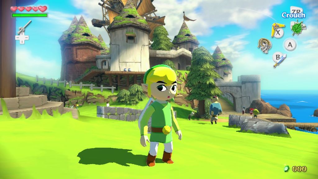
Gorgeous. Just gorgeous.
The Legend of Zelda: The Wind Waker is easily one of the most polarizing entries in Nintendo's popular adventure series. Back in 2003, after experiencing the gaming splendor that was Ocarina of Time and Majora's Mask, diehard fans of the series like myself were expecting a mature, technically proficient entry on the GameCube. Instead, The Big N decided to take a more artistic approach, utilizing a vibrant color palette and cel-shaded visuals. Naturally, many gamers were disappointed—some still bitter to this day—but Nintendo's bold new approach paid off in spades, resulting in one of the most visually timeless games of its time.
As such, I couldn't wait to check out the high-definition remake today at Nintendo's E3 booth. I was immediately taken aback by how gorgeous the game looked. Call me crazy, but I found The Wind Waker HD to be one of the most beautiful games on the entire show floor. Sure, the PlayStation 4 and Xbox One are capable of playing more visually intensive games, but you can't underestimate the power of genius art direction.
The demo I played was composed of two different sections, the first of which took place at the very beginning of the game in Link's tranquil seaside home town. The bright blue water and contrasting green of the grassy shore had me staring in wonder. Make no mistake, this isn't some half-baked HD port. Nintendo has taken the time to rebuild the graphics from the ground up. The character models looked absolutely fantastic and still retain the comedic charm of the original. On that note, if you're worried that too much was changed in the adaptation, don't be, as the art style is very much the same, just a whole heck of a lot prettier.
Controlling Link hasn't changed much in Wind Waker's transition to the Wii U. After a short time with the GamePad, I was acclimated to the new control scheme and found its benefits to be quite appealing. As expected, you can opt to play the entire game on the tablet should the television be occupied in your home. If you're playing on the big screen, however, your inventory and map are located on the GamePad screen, keeping your main display free from clutter. As someone who absolutely loves the Zelda universe, this added bit of immersion was a major plus. Simply tap and drag items/weapons on the handheld screen to map them to your button layout however you like.

So I wandered around the town for a while, gawking over the gorgeous visuals and getting trained in sword combat from a fellow villager. After I had a good handle on everything (it has been nearly a decade since I played the original) I jumped forward to the second part of the demo, a boss fight with a hulking bird. As I ran up a cylindrical tower, dodging the beast's attacks and laying waste to any foes foolish enough to cross my path, I made it to the roof, and then it was time for an all out battle.
The vibrant feathers of the winged monster set against the dark night sky was an absolute wonder to behold. I'm sorry for constantly bringing up the visuals, but man are they gorgeous! With a trusty hammer equipped, I was able to smash the protective helmet protecting my foe's head. Then it was simply a matter of sending a steady stream of arrows into the beast's face to bring it down. It was a blast, and even though I played it many years ago, the improved visuals and GamePad additions made it feel fresh.

If you've got a Wii U, you absolutely have to put this game on your radar. It's coming out later this year, and you can't afford to miss it. Those who don't yet have Nintendo's HD console should seriously consider picking one up for this game alone. It really is that good.


