This is just a collection of incredibly action-packed box arts, nothing more, nothing less. So, why waste time explaining things to you? Because that's exactly what these box arts do! Most video games are impossible to grasp by their title alone, so these box arts go well out of their way to throw explosions, shooting, and high-octane action at you as much as possible. Well, except for our first entry.
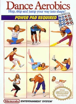
By definition, the box art for Dance Aerobics (Power Pad Required) is as action-packed as they come. There are so many actions on display here, including the evolutionary shuffle (middle left), the Carlton dance from Fresh Prince of Bel-Air (bottom left) and someone getting swallowed up by the official Nintendo seal of quality.
What I don't get is how each of these incredibly energetic, fit, and action-oriented people could have ignored the descriptor right on the box! You can't play Dance Aerobics on your Nintendo Entertainment System without the Power Pad, people! When are we going to get this through your headband-wearing skulls? I guess when you're this action-packed, you've got no time for instructions.

Two monsters. What more do you need? Nothing screams action like being outnumbered by massive space-monsters. I'm guessing the first monster said "oh, damn player, you are way too good for this game" and decided to pop a second, more slobbery monster out of his chest. Who designed this box art? Did they say to themselves half-way through "there's no way this monster is intimidating enough"?
And someone needs to tell that space-ship pilot that there's a gigantic tail behind him because I don't think he can see out of the cockpit in that direction. There's just way too much going on in this box art. It's almost too action-packed. That's probably why the background is completely black. I think the designers probably had like a car crash or something behind the monsters but they were like "woah, time to bring it back in." In… to what? We're in space and a car crash wouldn't make sense.
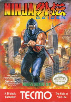
Ninja Gaiden for the Nintendo Entertainment System not only had an incredibly action-packed box, it was also an incredibly action-packed game. That's what you want in your box art… proper representation of the experience contained on the plastic cartridge inside. Unfortunately, Tecmo forgot to set everything in the game on fire, so that whole tactic was blown.
Obviously in Ninja Gaiden you play as a ninja, but did you know that the game was "A Strategic Encounter" and "The Fight of Your Life"? No? Well you should have! It's right there on the damn box! It's OK because you were probably distracted by the fact that everything on the box is on f***ing fire and basically this Ninja already screwed up and failed to save this city. Let's see if you can do better in the game.
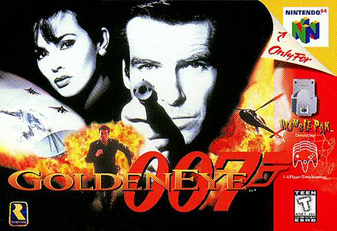
First of all, this box features a sexy woman. That's more action than any of the boxes we've seen so far, so already James Bond is climbing the ladder to excellence, but then you throw gun pointing, running, exploding, jet-fightering, and helicopter piloting in and now you've got a must-buy game!
It even lets you use the freaking Rumble Pak! That's action you can feel, or at least action you can try a few times, use the batteries up, and then never use again. The one problem with Goldeneye 007's box is that it features a satellite dish. This isn't a list of the most science-and-technology focused box art, OK? Keep that stuff out of here.
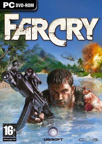
This box mixes in a few key elements to make sure no one accuses it of ripping off Goldeneye 007. First of all, there's water. This seems to suggest that you'll need to quench your thirst from all the action in game. Of course, it's salt water and that would be stupid and quite counter-intuitive to what you're trying to do, but box arts don't have to make sense so shut up.
Far Cry's box shows other boxes that action-packed covers don't need to throw a bunch of gaudy graphics at the potential purchaser. You just need the hint of action, the hint of destruction and explosions, to hook that person and never let them go. I mean, even the logo is a little beat up. Nothing suggests high-octane thrills than a font that's seen better days.
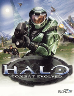
Halo: Combat Evolved also puts a gun and a protagonist right up front. Wondering what you're going to be doing for eight hours after you take this game home? Shoot stuff, possibly get shot at, but not until after you've shot more stuff. That's not the true genius on display here though.
Microsoft earns its spot on the action-packed box art feature because STUFF IS FLYING AFTER A CAR AND THEY'RE BOTH SHOOTING AT EACH OTHER. Simply amazing. Obviously it would have been pretty interesting to see the player's character in the car, or maybe feature that really awesome bit of gameplay front and center, but then you'd be losing the whole "you're going to shoot things" message, so….
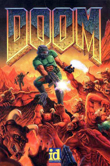
Aw, you know what, screw the rest of those other box arts. This is easily the most action-packed box art, ever. This dude is shooting at all these demons, but all the demons want to do is shake his hand. This one in the top right corner is trying to give him a super-powered high five, but how bad ass is it that the guy just keeps shooting?
It's so bad ass that his buddy on the left side is trying to catch up just so he can join in. Honestly, what else do you need to see on a box to get you to buy it? Just buy this game, open it, install it, wait for the drivers to update, launch it, and play. Then you'll know why you bought this game…. Hint: it's for the action.
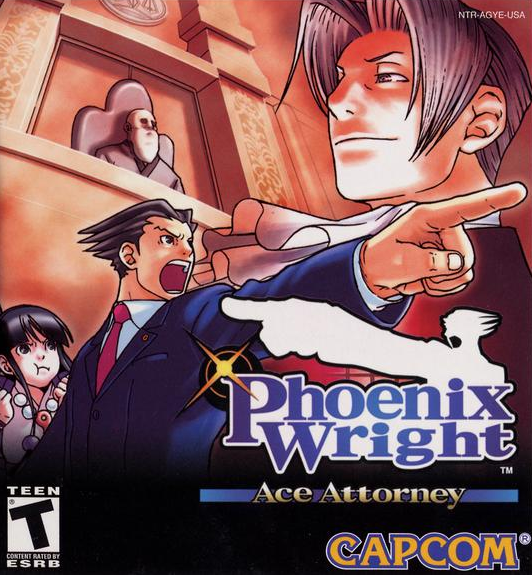
Pointing, smirking, shouting… trying to chew a mouthful of food… sleeping, I guess. This box art has it all. Sometimes all it takes is a dramatic look and action sparks. Another action represented in this cover? Judging.
OK, so there isn't much going on in this Phoenix Wright: Ace Attorney cover from Capcom, but there's definitely the suggestion of action. Maybe you see this on store shelves and you think "this must be one of those new first-pointer simulators, or FPS games," so you take it home, throw it in your machine and suddenly you realize this game is amazing. Who gives a sh** what the box art looks like right?
Can you think of any other amazing, action-packed box art? To post a link in the comments, remove http://www. from your link and then hit "Add Comment." It's not so hard!
