[Is it possible that the rise of the Evil Casual Gaming Empire isn’t such a bad thing after all? Casual Difficulty considers the effects—both good and bad—that casual gaming has had on hardcore gamers. Think of this semi-regular column as a peace pipe extended from our gnarled FPS-worn hands to the soft, innocent hands of our casual brethren and sistren. This time on Casual Difficulty, a look at control mechanics and controller design.]
I finally got around to playing Limbo this week.
Because I’m a grizzled and cranky old gamer, the first thing I always do when I play a game is fiddle with the default settings. So as soon as I boot up Limbo I jump immediately to the options screen. Before I get the chance to set my gamma and sound levels exactly where I want them, I see the “How to Play” option listed at the top. I click it expecting a tutorial. Instead, I’m greeted by a diagram of a simplified Xbox controller with just the left analog stick and two buttons highlighted. One button is labeled “jump”, the other “action”. That’s it. It’s comically simple. I felt a bit stupid, almost as if I’d been caught looking at the instruction manual for how to turn a doorknob.
While the reason for this simple design choice might seem obvious, I think there’s something deeper going on here, and it has to do with the advent of the casual gaming market. With the phenomenal success of Apple’s various products and Nintendo’s Wii and DS, “simplicity” has come to be associated with dirty words like “accessibility” and “mass appeal”. But casual game designers see simplicity as a direct response to the complexity and alienation of modern game controllers. What if they’re right? What if all games, even those we hardcore gamers hold dearest to our hearts, have become too complex? Do we really need all of these buttons?
Those of us who have grown up gaming have developed a deep literacy and fluency with how to handle any controller. Typically, once we know what genre we’re dealing with—FPS, sports, racing, RPG, etc.—we have a pretty good idea of how the controls work. We’ve spent years wearing grooves into our brains that allow us to pick up nearly any game straight off the shelf and have an intuitive sense for how it controls.
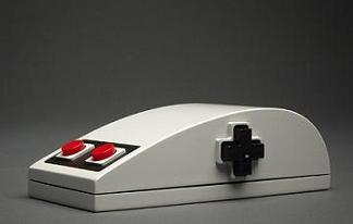
In direct response, one of the defining features of the casual gaming movement has been to change the controller paradigm. These designers won’t rest until they’ve shaken off all the excess garbage that’s attached itself to controllers over the past few decades. A big part of that has been the move to gesture-based controls (i.e., motion controls), but another line of attack has been to use fewer and fewer buttons. It’s as if there’s a branch of game design committed to returning us all to the dark ages of the primitive Atari 2600 joystick, or in the case of Microsoft’s Kinect, to a time before controllers even existed.
This is all old news if you’ve been following game design trends of the past few years, and there’s been a sizable and loud backlash in gaming communities against the waggle-loving hoards pounding at the Holy Gates of teh 1337 Gamerz. But what no one seems to have noticed or acknowledged is that simplifying design isn’t a move away from difficult, deep, or hardcore games; it’s a move toward them. Let me explain what I mean.
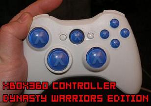
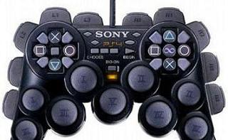
 One of the detrimental side effects of increasingly complex controllers (the standard 360 and PS3 controller each has 13 buttons, two analog sticks, and an eight-way directional pad) is a tendency towards a status quo. As controllers have become more elaborate, we gamers have become less receptive to changes to established control schemes.
Controllers have become so complex that the slightest change could upset the entire balance. Take, for example, the uproar over the relatively minor changes to the control mechanics in Killzone 2; change the reaction times the slightest bit from the FPS genre norm, and all hell breaks loose. Through no fault of our own, as more buttons, sticks, and triggers get attached to our controllers, our gaming genres become more stale and incestuous.
There’s a reason that the changes from Madden to Madden have been so slight over the years. And there’s more to blame than creative poverty in the resemblance of every first-person military shooter to every other first-person military shooter. It’s in large part due to our button-laden controllers. Sure, you can blame runaway gaming budgets and increasingly risk-averse consumers to the growing samey-ness of the gaming industry, but controller design shares just as much of the blame. Because control mechanics have become so complex, there’s no room for substantial change. Genres have ossified over the past decade to the point where the only really “new” thing from game to game is story and graphical bragging rights. And even these things have started getting more and more recycled.
But there is another way. More and more design teams—and not just casual game developers—are turning back the clock to a time before the excesses of controller design set in, back to a time when game pads had only one or two buttons. It isn’t just nostalgia that’s responsible for the resurgence in old-school 2D gaming. Nor is this just pandering to the unwashed casual market masses. Instead, designers are breaking mechanics down to their bare essentials in order to shift the focus to level design, player interaction, and even emotional engagement. Like the mythical Tower of Babel, control schemes have gotten too elaborate for their own good and need to be torn down and brought back to earth.
So-called “art games” like Braid, Limbo, and flOw, as well as retro-minded 2D games like Mega Man 9, Shadow Complex, and Scott Pilgrim vs. The World, aren’t revisiting 2D just because it’s cheap or gimmicky or nostalgic. Nor are they necessarily trying to broaden the gaming audience. They’ve gone 2D because they can strip away all of the excess controller baggage of the past decade. These games aren’t any easier than any other game nor would they (with the exception maybe of flOw) be termed “casual” games by hardcore gaming aficionados.
 Obviously, my point isn’t to say that games have become too hard to figure out. Like you all, I know very well how to use these grotesquely overdesigned pieces of plastic. But all these buttons, levers, pulleys, latches, and buckles might be getting in the way of truly innovative game design. I’m all for games that test our finger dexterity, but too often it seems to come at the cost of testing our mental (and perhaps our emotional and social) dexterity, as well.
The popularity of the bowling game in Wii Sports and Wii Fit might look like a vision of doom to the hardcore gaming populace, but we have those games and others like them to thank for reminding us of the basics of good game design. We’ve been slowly straying from those fundamental principles over the past twenty years, and our own buttons have been standing in the way. The rise of casual gaming has given all of us the opportunity to rethink established norms in almost every genre, and it’s given us the chance to experience entirely new genres. Now with a few years’ worth of hindsight, we can begin to see the payoff. Just like Ezra Pound turned to the origins of the English language and Pablo Picasso turned to the basic shapes and colors of painting, game designers are returning to the fundamentals of design—and we have the casual gaming market to thank for it.


