When the Epic Game Store launched just short of a year ago, it was missing tons of features, and the initial game selection wasn’t the amazing deluge we have now. But it did have one thing over Steam: its slick library. Just having big artwork front and center was an obvious improvement over Steam’s default look. In fact, Steam hadn’t improved things much since the days of Half-Life 2, and it really showed. As of this month in beta, and perhaps spurred on by new competition, the Steam Library Update finally brings things forward to a modern UI. Not only is game artwork now front and center, but your collection feels more dynamic and usable than ever before.
Steam Library Update | Heading back home

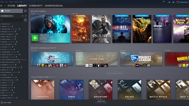
Let’s start with the home screen, something the previous iteration of the library lacked entirely. Front and center, you have a carousel of in-game events for your recent titles and other games you have installed. You can see when updates come, announcements from developers, and anything else posted in a game’s news feed. This information used to live in the activity feed and would only show up if you followed a specific game. It’s a nice feature, but not many knew you could even go that deep. Now, when developers want to get the word out, they have a much better chance of reaching a sizable audience.
ALSO: Control shows why we need mature developers in an unstable industry
Right below that, you have a listing of recent games, including what you’ve most recently played and your recent activations. Below that is a shelf that features games all your friends have recently played. Both of these are pretty common features on modern consoles, and it’s great to see Steam pick up on the trend. Having your most recent acquisitions in such a prominent position is always useful, as you’re likely to want to play them sooner rather than later. Seeing all your friends swarm around an older title could alert you to an exciting in-game event. These two additions feel like vital ways to stop those with huge collections from suffering from indecision on what to play on a lazy Saturday.
Steam Library Update | Keeping things organized

To that end, Steam has also added Dynamic Collections, which is a fancy way of organizing your games by genre. Steam has always had the ability to collect games together in a custom way, but manually going through every single title is a daunting task. Even the most conservative of Steam purchasers will probably have a few hundred games to their name thanks to popular bundle sites and the storefront’s longevity.
Now, instead of trying to retain what each of your games is about, Steam will do it for you. Just input every category you want in your list and Steam generates and updates them automatically. It even goes beyond Steam’s default collection of Action, Adventure, and the ever-useful Indie. The client lets you pick from any of the store’s approved tags, meaning that the system will automatically keep up with new fads and changing tastes. Want to see which of your games are themed after the ’80s? You got it. Need all your tower defense games lined up in a row? Easy. What about finding games with themes like LGBTQ, Dinosaurs, and Cyberpunk? All ready for the picking. The system will sort games into multiple categories and you can add as many as your heart desires and is a nifty way to sift through decades of purchases.
Steam Library Update | Browsing the video store

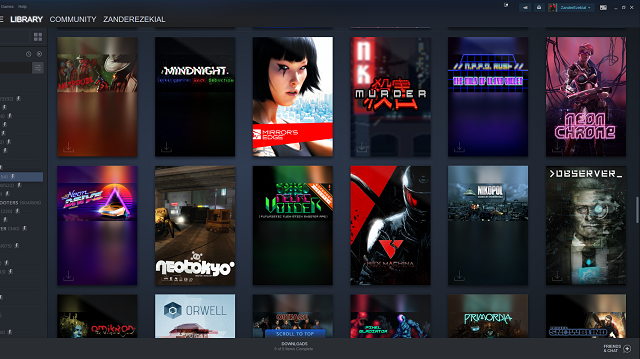
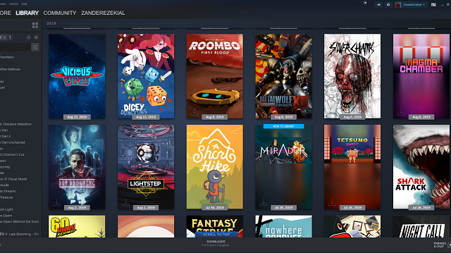
Once you have an extensive list of every battle royale you have installed, you can click that category to bring up the main event. The biggest improvement out of everything, even trumping genre search, is how Steam showcases your library visually. Instead of a list of small favicons or awkward grids of art rectangles, you get a straightforward showcase of proper traditional box art. It’s the same art you’d see on a shelf at Walmart and it makes your collection immediately look more like a tangible thing.
Even the games without an updated full box art look way better in this new scenario. You still get the awkward horizontal graphics, but they’re smaller. The color gradient that fills out the rest of the box helps the games blend in, even in cases where the developer or publisher will never update to the real thing. If you can’t stand having these compromises, you can set custom artwork yourself, just like in the old grid view. I’ve already seen a few communities on Twitter sprouting up to make custom box art for just such a purpose.
The improvements don’t stop at the slick new box art as the game detail page, the one screen you saw previously, no longer promotes outdated news stories from an outdated RSS feed. Right below a gorgeous zoomed-in banner and blown up logo, you get a custom activity feed just for that game. You can see when friends are playing, when they unlock achievements, and if they have commented on that specific game in the past. The previews of community screenshots, guides and submitted videos sit below the activity feed. To the right, you have boxes that host your screenshots, Steam achievements, and your earned trading cards. They may seem like small improvements but they foster a sense of community that platforms like this thrive on. It’s partly why people have so much beef with the Epic Games Store: Steam is where their friends are. And this update makes that even more clear.
Steam Library Update | Next-gen PC gaming

In a way, it seems like Valve took the best of what Microsoft and Sony promised back at the beginning of this generation and finally delivered. Steam tracked all these things in the past, but they’re now sitting in a much more logical environment that should spur much more interaction. Epic Games have said in the past that it is not interested in these types of community features, so Valve is smart to push them into the spotlight. The biggest thing separating Valve from the competition nowadays is an impressive feature set driven by a passionate community. With this update, the Steam client finally puts those features into places where even the most casual of users will find them.
And even the most hardcore users, like me as Valve has delivered everything I could have wanted and more. Dynamic categories let me rediscover games I never got around to. The homepage keeps me up to date on every happening in the hottest games. And then there’s the box art. I cannot overstate how much of a difference a simple resolution change makes. This is the way a games showcase should look, and it’s fantastic that developers can finally let their artwork — and by proxy their games — shine.


