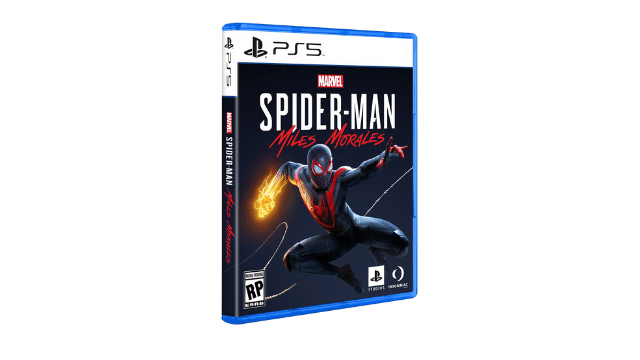
Sony stealth dropped what the PS5 game box will look like when games hit shelves later this year. Unsurprisingly, the new design is similar to the old one, with some minor adjustments. These changes reflect the aesthetic seen in the PS5 console, which was revealed last month in Sony’s Future of Play stream, and looks to be an evolution of the already existing design.
The main difference between the PS4 and PS5 game boxes is the system label at the top. On PS4 boxes, the label has a white logo and text on a blue gradient background. For the PS5, this has changed to a black PS logo and text on a white background. The case itself is still the standard Blu-ray size that Sony has used since the launch of the PS3. It’s also still made of the transparent blue plastic introduced with the release of the PS4.
The example PS5 case is also the debut of the box art for Spider-Man Miles Morales. One small detail missing from the PS5 packaging that was present on the original Spider-Man PS4 case is the “Only on PlayStation” moniker on the top label. It’s possible this will be added later, or that it was removed due to more PlayStation exclusives later being released on PC. Horizon Zero Dawn carried the “Only on PlayStation” label when it was published, but was recently revealed to be destined for PC sometime later this year. We do see a new PlayStation Studios logo at the bottom right corner, so this may be a new, more subtle indicator that a game is a console exclusive.
While the PS5 case is very similar to the PS4, it won’t be hard to see the difference between them on a shelf. It’s interesting to see Sony embracing the color white this console generation. Since the PS2, Sony has used black and blue almost exclusively for PlayStation branding, and the addition of a third color is a significant move in the company’s design paradigm.
[H/T: PlayStation LifeStyle]


