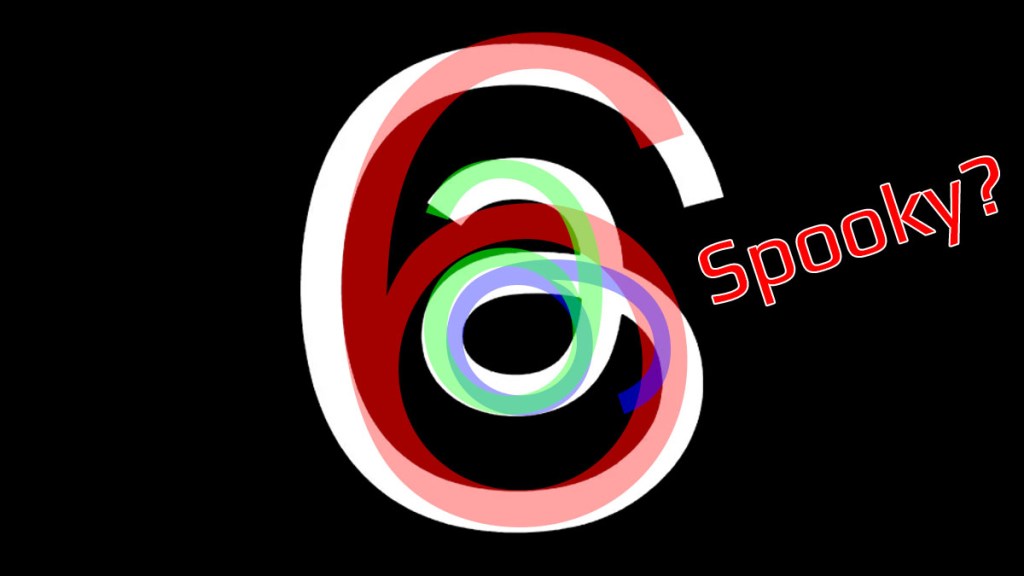
The Threads logo has confused users, and many are wondering what it’s supposed to reference. The most obvious answer is that it’s based on an at sign (@). Some have speculated that the Threads logo is a piece of string. Yet another far-out theory is that the Threads logo is 666, the number of the beast. Unfortunately, Meta’s answer is pretty boring.
What is the Threads logo supposed to be?
Meta says the Threads logo is inspired by the at sign (@), as seen in Instagram’s typeface. While it didn’t say why this logo was chosen, it’s more than likely a reference to the symbol’s functionality on Twitter. As the latest clone of the Elon Musk-owned service, it’s no surprise that it’s attempting to subvert the at sign into being associated with Threads.
Despite Meta’s explanation for the Threads logo, there’s chatter that its origins are more insidious. Some have hypothesized that the number of the beast, 666, is hidden within. What that supposedly means isn’t clear other than accusations that the service (and Meta) are vaguely evil.
From a more positive angle, The Threads logo’s unconventional design could represent Meta’s strategic move to rejuvenate its public image. The logo’s striking contrast of white against black delivers an edgier vibe than Facebook or Instagram’s. This might be a deliberate step away from Meta’s previous branding efforts and an attempt to draw Twitter’s “hipper” user base.
As the logo continues to spark intense speculation, it cements its place as a symbol of curiosity in the tech world. This visual enigma invites users to interpret and reimagine, generating a buzz that adds an extra layer of appeal to the Threads experience. Ultimately, the success of the logo lies not just in its visual charm but also in its ability to inspire conversation, intrigue, and even controversy in the digital community. As Threads evolves (and if it manages to survive), so will the legend of its logo.


